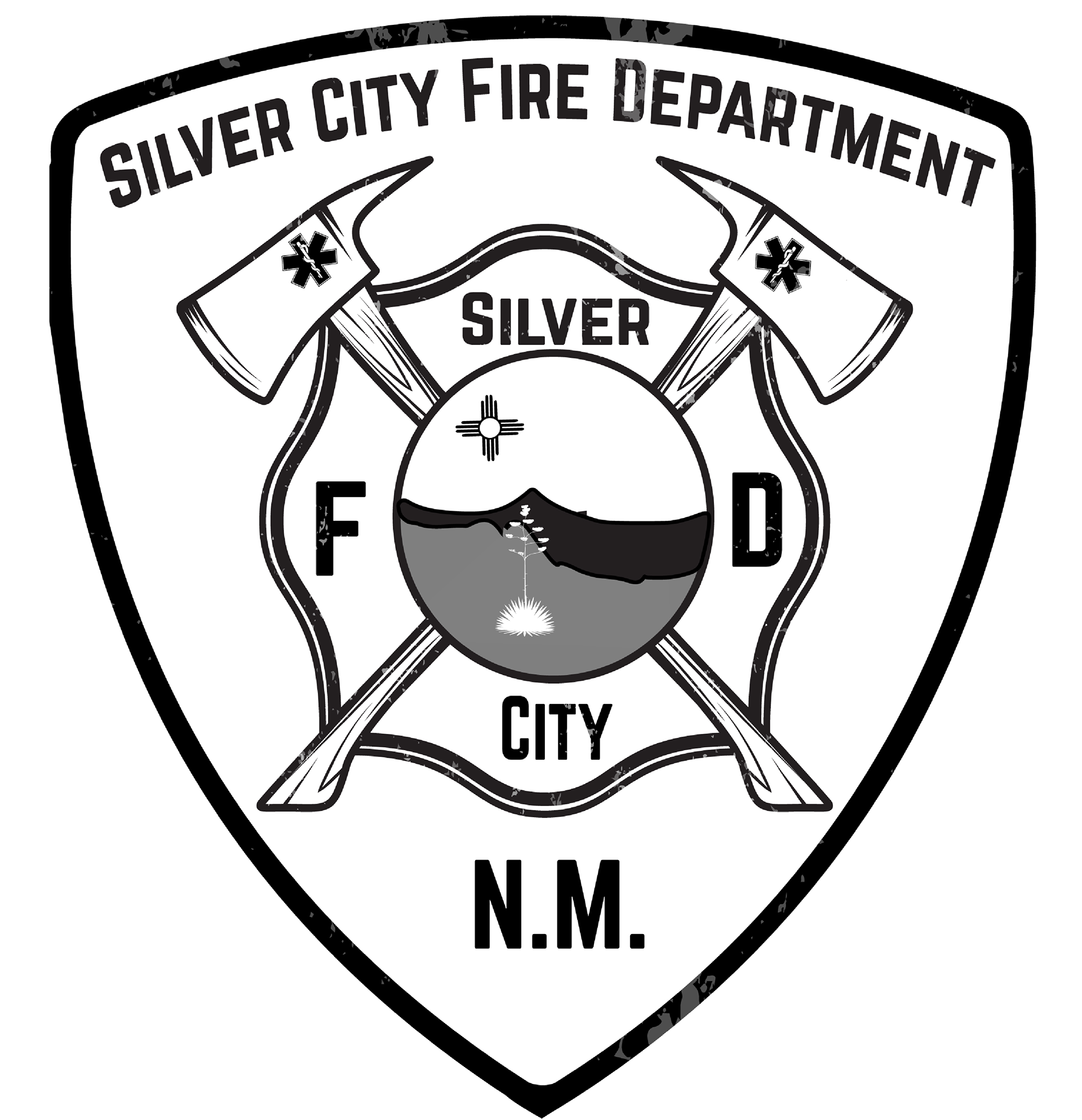
This bold and professional emblem for the Silver City Fire Department captures strength, service, and local pride. Featuring crossed axes, a firefighter’s shield, and a scenic depiction of Silver City, NM, the design integrates tradition with a sense of duty. The distressed texture adds a rugged, time-honored feel
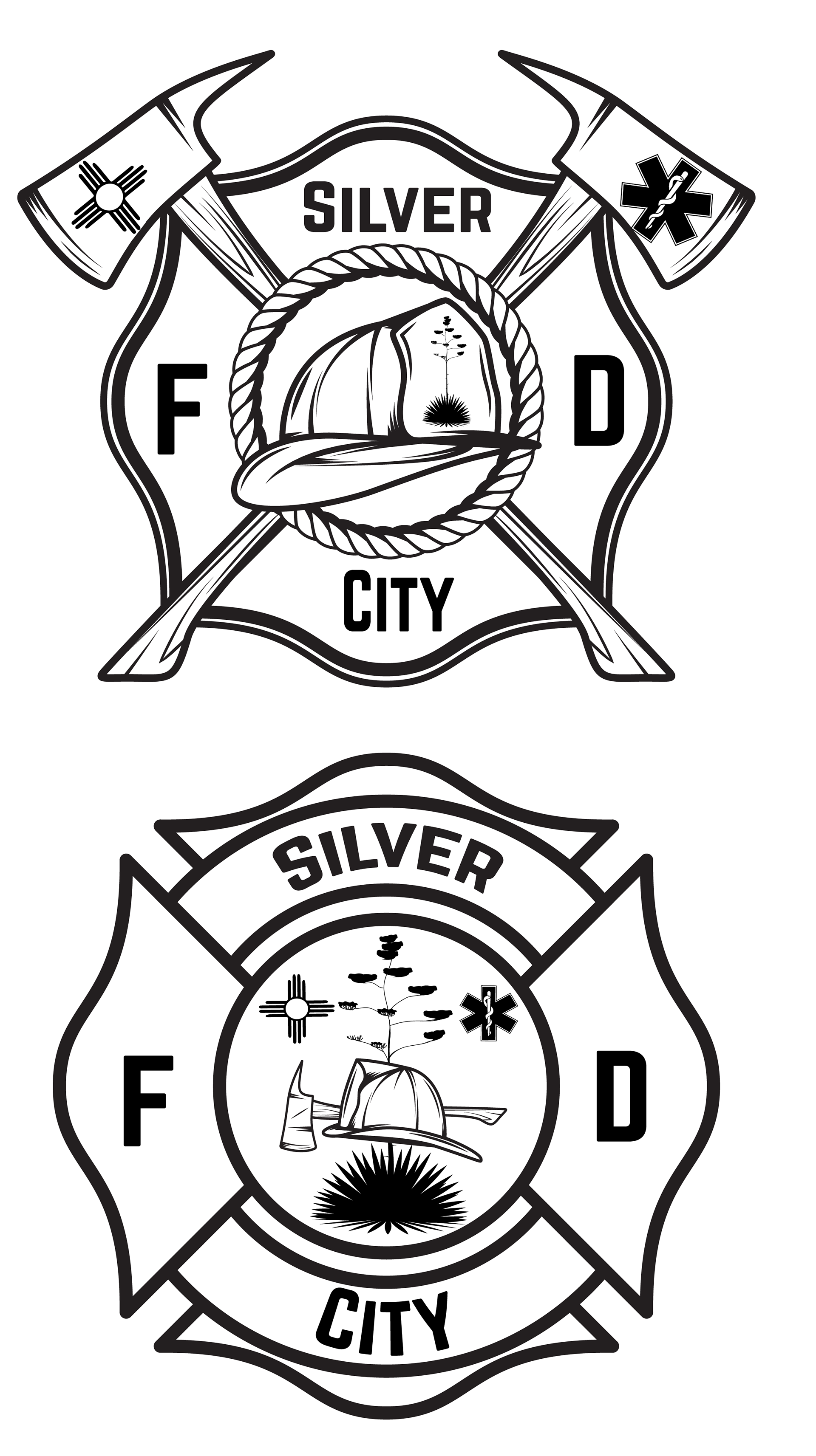
Variations on the logo made for the Silver City Fire Department annual T-shirts.
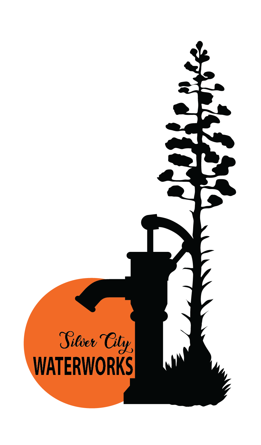
A bold, minimalistic logo featuring a resilient century plant and a vintage water pump, framed by a warm orange sun. This design honors the legacy of water in Silver City, blending nature and industry in a timeless, striking visual.
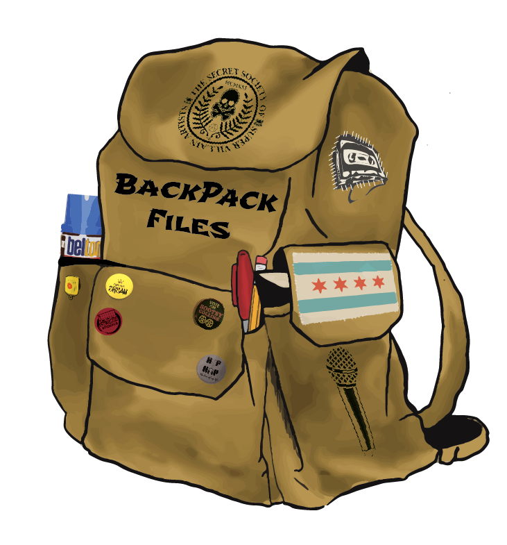
This logo design was created for a traveling performer and writer based in Chicago, blending personal identity with local pride. Featuring a stylized backpack adorned with the iconic Chicago flag, the design captures both the essence of movement and the performer’s connection to their roots. The text “Backpack Files” is integrated seamlessly into the concept, symbolizing the journey of a writer and performer who carries their craft with them wherever they go. The Chicago flag elements bring a sense of place and belonging, while the backpack imagery evokes adventure, exploration, and storytelling. This logo reflects the dynamic, ever-changing life of an artist on the move, rooted in their city but always traveling and evolving.
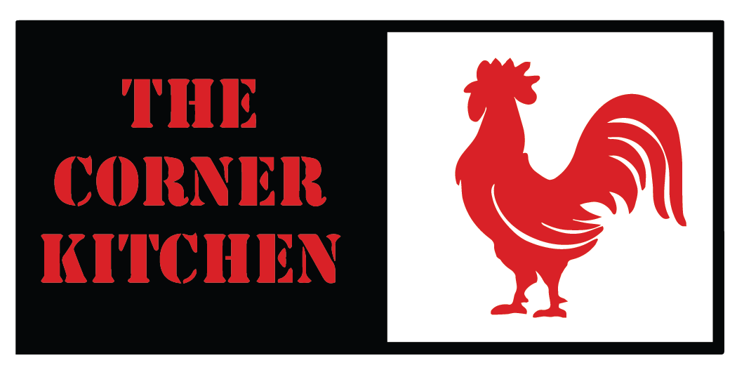
This logo design for The Corner Kitchen embodies the bold, vibrant spirit of the brand. Featuring a striking rooster as the central element, the design symbolizes the kitchen's commitment to bold flavors and fresh, high-quality ingredients. The black, white, and red color palette creates a powerful visual contrast, reflecting both the richness of the food and the energetic atmosphere of the restaurant. The bold font choice complements the rooster imagery, enhancing the sense of strength and confidence in the brand’s identity. This logo captures the essence of a place where bold flavors meet culinary creativity, making a memorable statement at first glance.
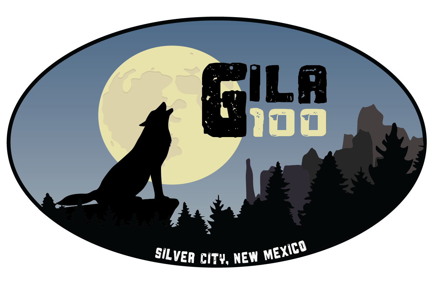
This dynamic logo for the Gila 100 Ultra Marathon embodies endurance, wilderness, and the untamed spirit of the race. Featuring a bold graphic of a wolf howling at the moon within an oval frame, the design reflects the rugged beauty of the Gila wilderness and the determination of ultra runners who take on this challenging course. A powerful symbol of strength and perseverance, this logo captures the essence of the adventure.
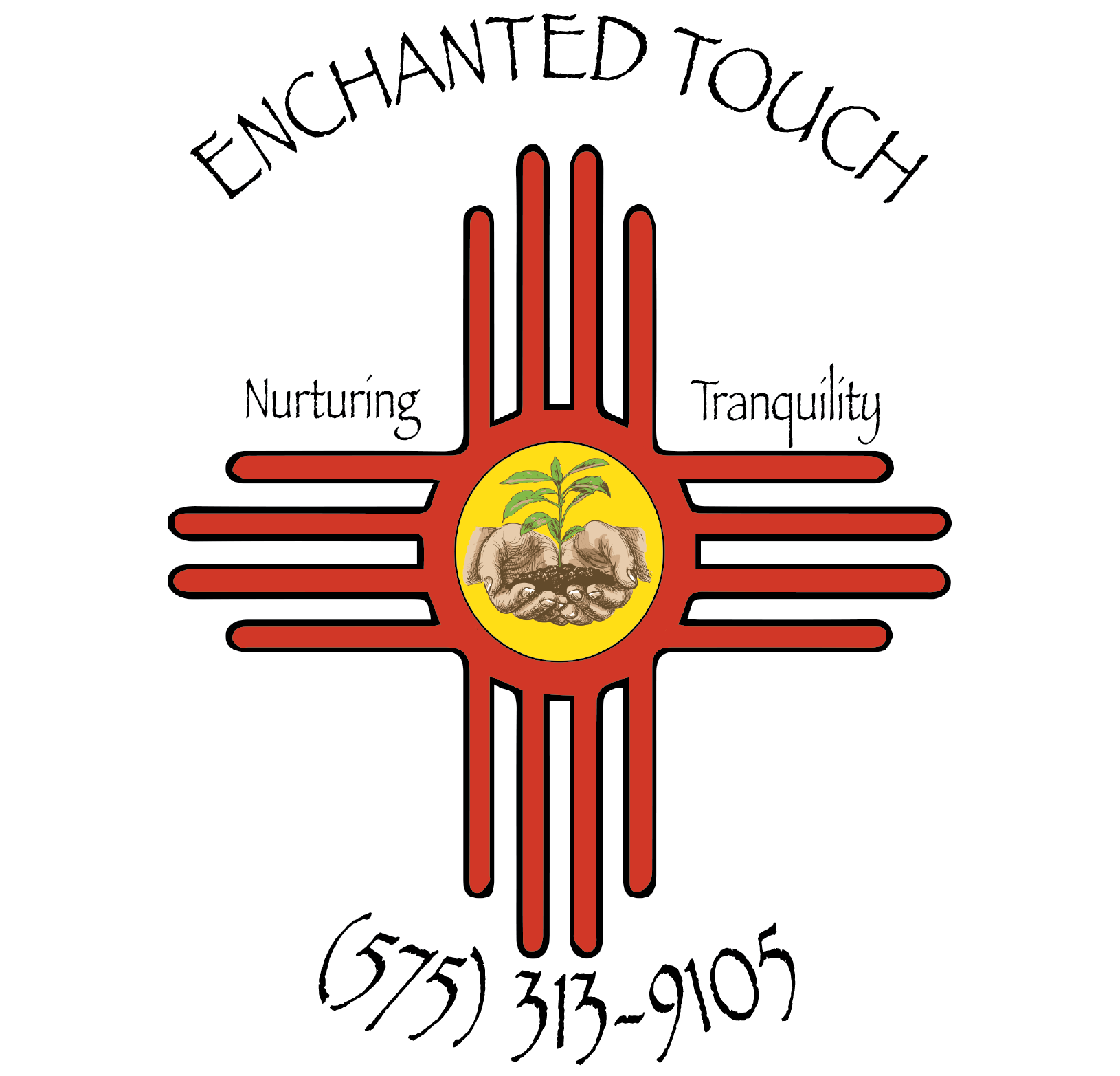
This logo for Enchanted Touch beautifully integrates the iconic Zia sun symbol with a nurturing pair of hands cradling new growth, representing care, healing, and renewal. The earthy tones and organic imagery convey a sense of tranquility and connection to nature, while the typography adds a personal and artistic touch. A perfect blend of tradition and wellness, this design captures the essence of the brand’s mission.
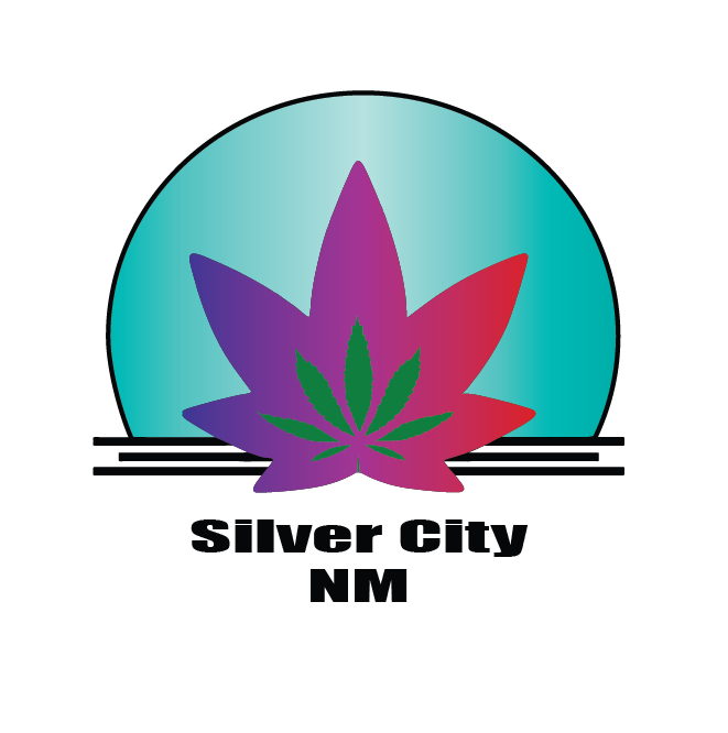
A clean, striking design featuring a radiant gradient backdrop, encircled by the company’s name and city. At its heart, a bold cannabis leaf symbolizes growth, quality, and the passion behind Phatboy Charms’ cultivation, fueled by sustainable, living soil practices for the purest harvests. Simple, strong, and unforgettable.
A sleek, neon-inspired logo designed to capture the essence of The Bong Factory—a contemporary ceramic shop blending artistry with modern design. Bold, simple, and striking, this visual identity reflects the shop’s cutting-edge aesthetic while keeping things effortlessly cool.
A vibrant fusion of whimsy and culture—this logo features a bold woman rocking a Mad Hatter hat, her afro crowned with confidence, against a splotchy watercolor backdrop. A cannabis leaf adds a rebellious, organic touch, capturing the essence of creativity, individuality, and elevated vibes.
A bold, organic design featuring a fully flowered cannabis bud and flowing smoke encircling the company’s name. This logo symbolizes the harmony of nature, growth, and the sacred energy of the sun, embodying the essence of Sacred Sol Farm.
This design for Desert Eclipse captures the essence of the company’s mission: to create transformative music experiences in the heart of the desert. Featuring the Seed of Life as a focal point, the design symbolizes unity and growth, blending the organic flow of nature with the energy of music. The darker tones of the image evoke the mystique of the desert landscape, while the bold “Desert Eclipse” text ties the visual narrative to the brand’s identity. This piece embodies the fusion of art, sound, and environment, highlighting the unique atmosphere Desert Eclipse brings to its events.
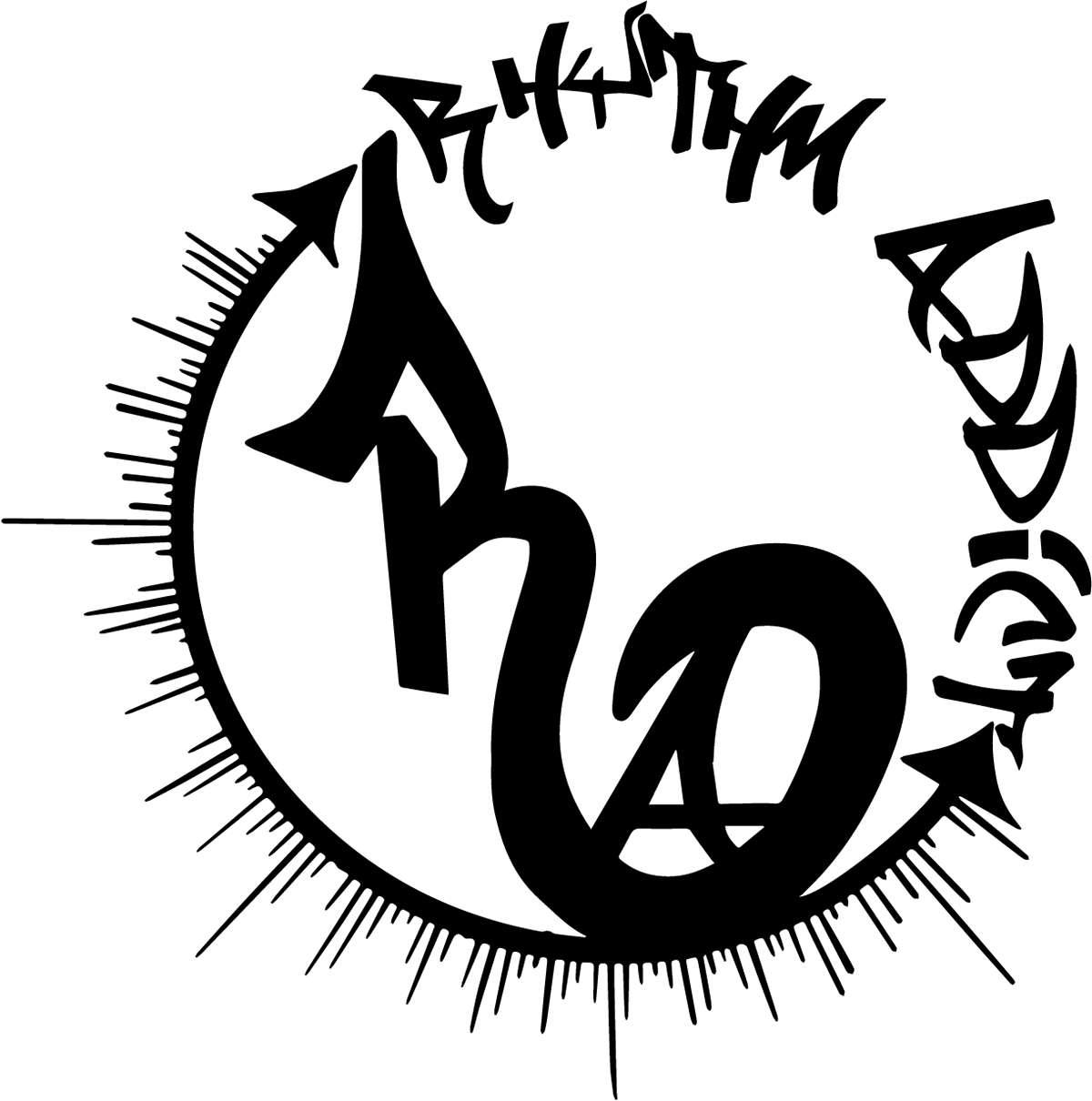
A dynamic, graffiti-inspired design capturing the heartbeat of hip hop. The company name is seamlessly merged in bold, street-style lettering, encircled by a rhythmic pattern that embodies movement and syncopation. This logo pulses with energy, reflecting the addictive rhythm at the core of every track.
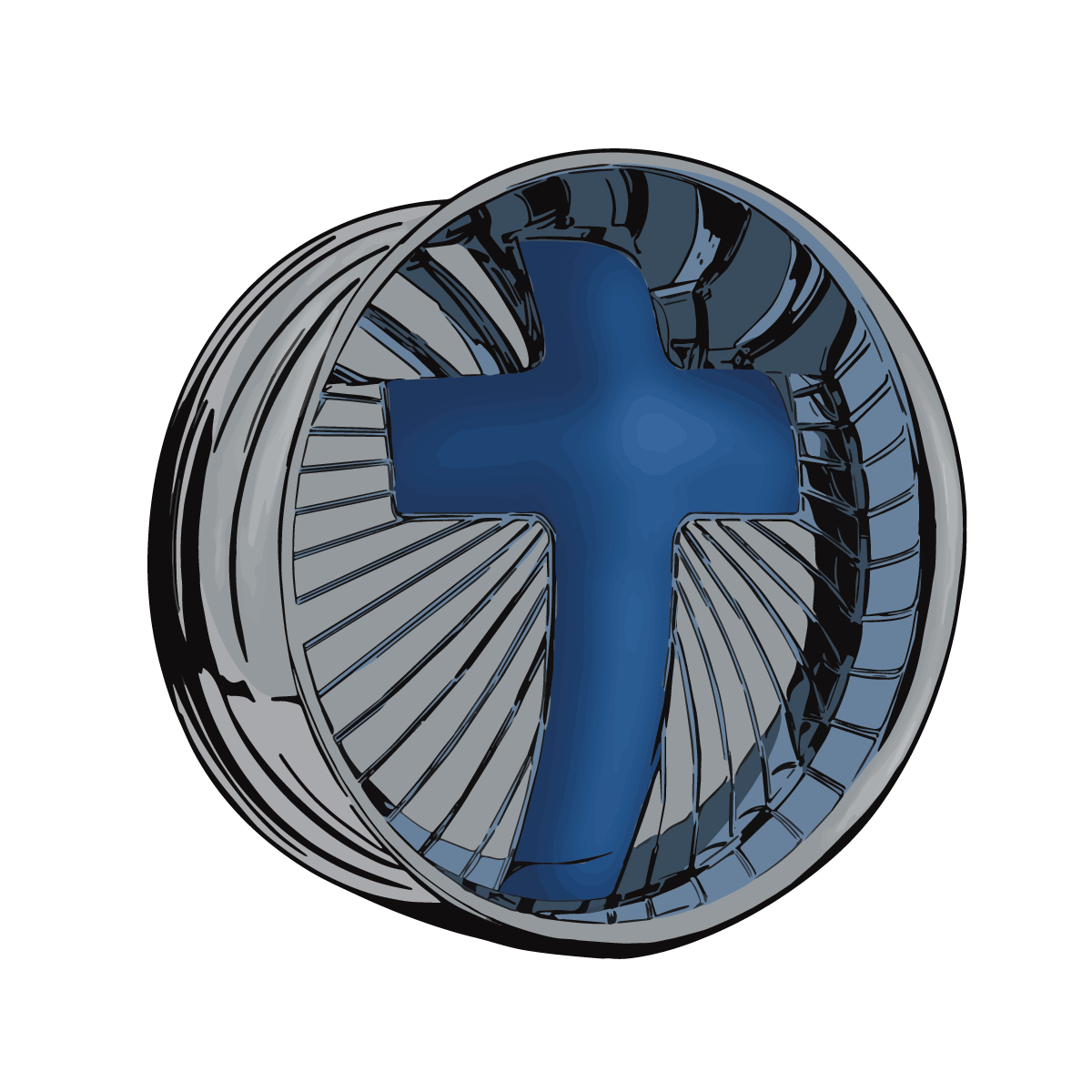
This custom-designed logo for Covenant Auto blends faith and automotive elements into a striking visual identity. The bold blue cross at the center symbolizes integrity, trust, and the company's strong values, while the stylized wheel represents motion, precision, and excellence in automotive service. The combination of metallic tones and sleek detailing conveys professionalism and modernity, making it a distinctive mark for the brand.
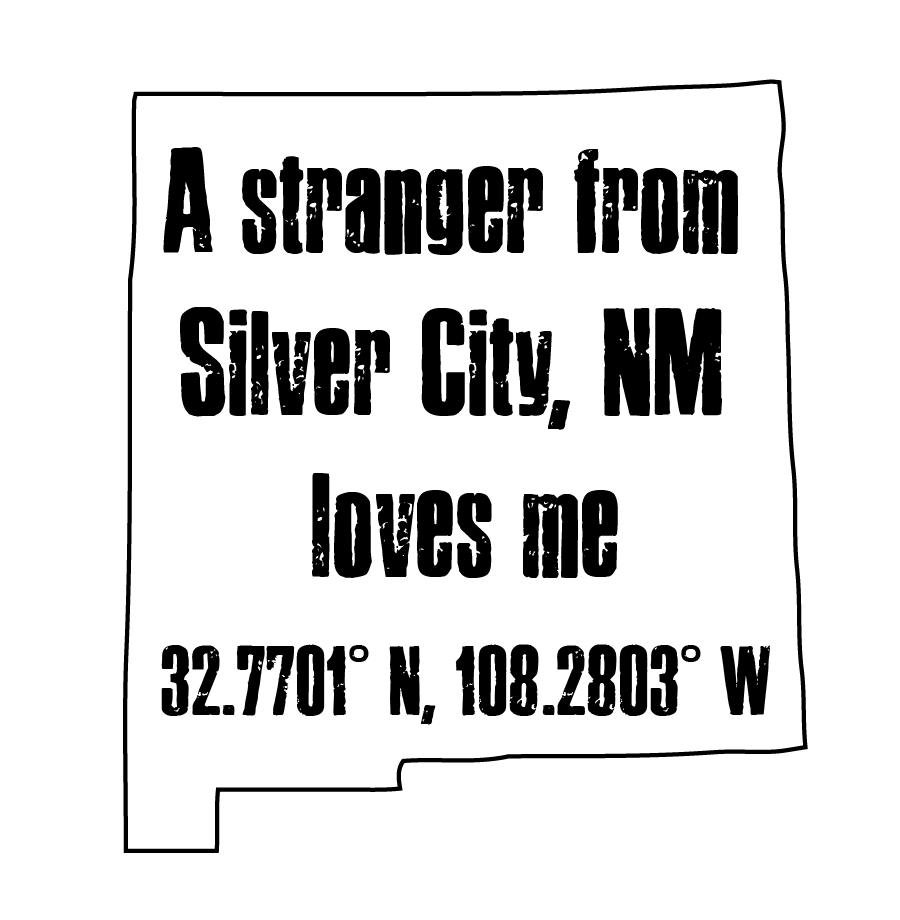
A custom design featuring bold, outlined typography within the shape of New Mexico, grounded by the exact coordinates of Silver City. This piece is a tribute to local pride, connection, and the love that ties us to the places we call home. Simple, meaningful, and uniquely personal.